Introduction

The Problem
Rightmove and Zoopla had defined what UK property search looked like for fifteen years — and both had been built around what agents wanted to list, not how buyers wanted to find. Dense grids. Inconsistent tooling. Discovery treated as a filter problem rather than a human one. Boomin's challenge wasn't to copy them better. It was to design a platform that put first-time buyers — the people most underserved by the category — at the centre.


Research & Insights
Research focused on understanding how users browse property platforms and where friction commonly occurs during discovery. These insights reinforced the need for strong hierarchy, predictable patterns, and a layout that supports quick scanning while allowing deeper exploration.
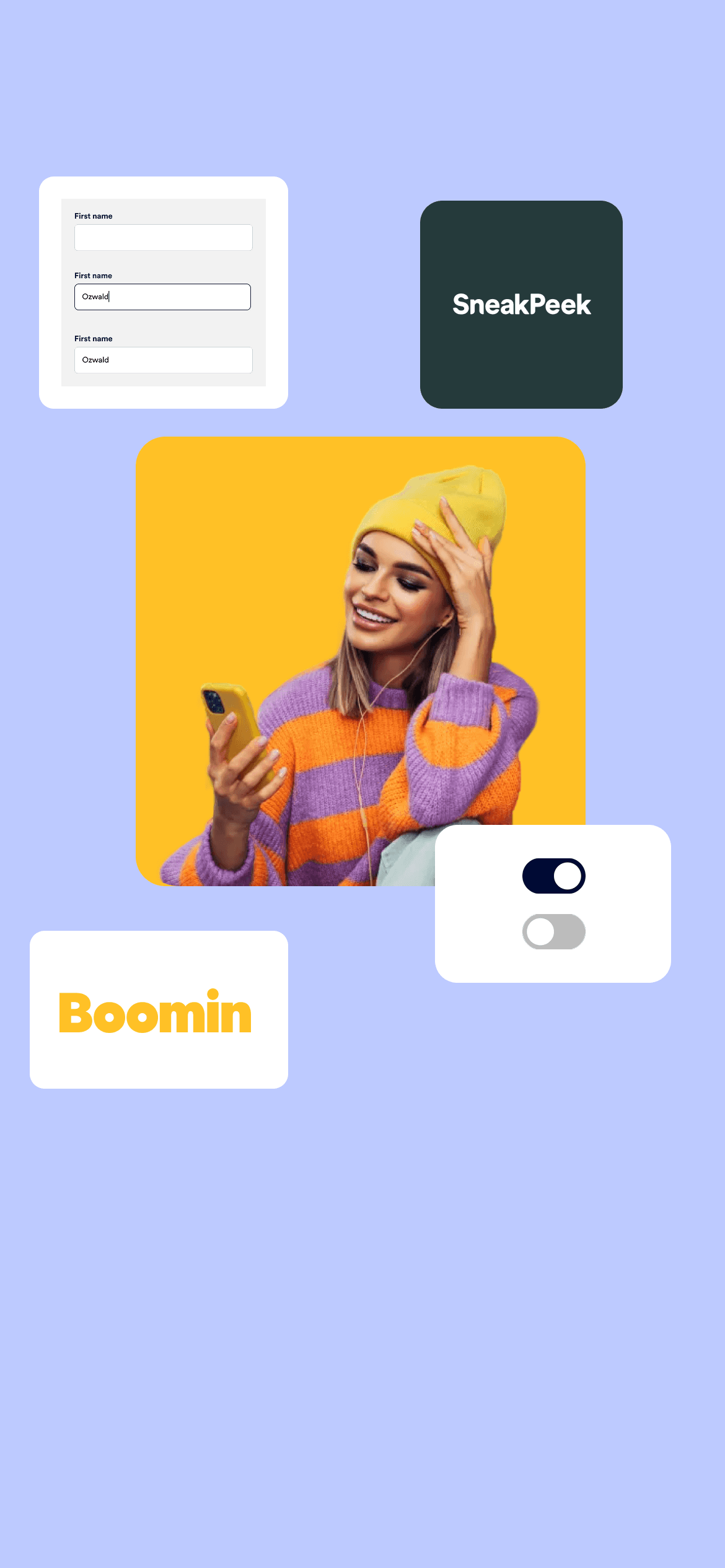
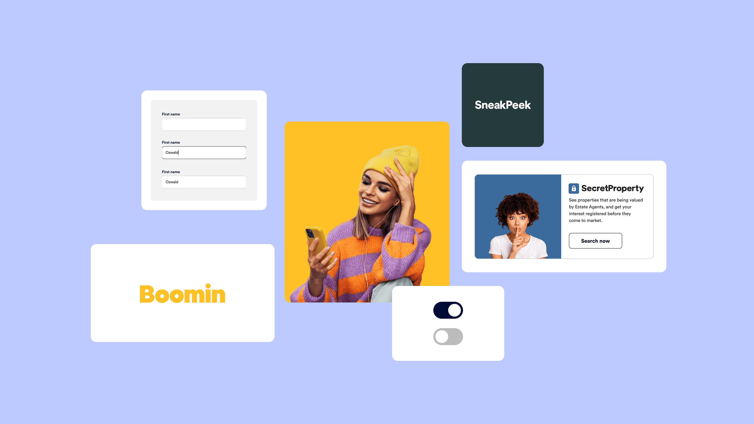
01
02
03
04

The Solution
Rather than treating search, valuation, and discovery as separate products, the design unified them under a single visual language and interaction model. Each tool was designed to feel like a natural extension of the browsing journey.

The Craft
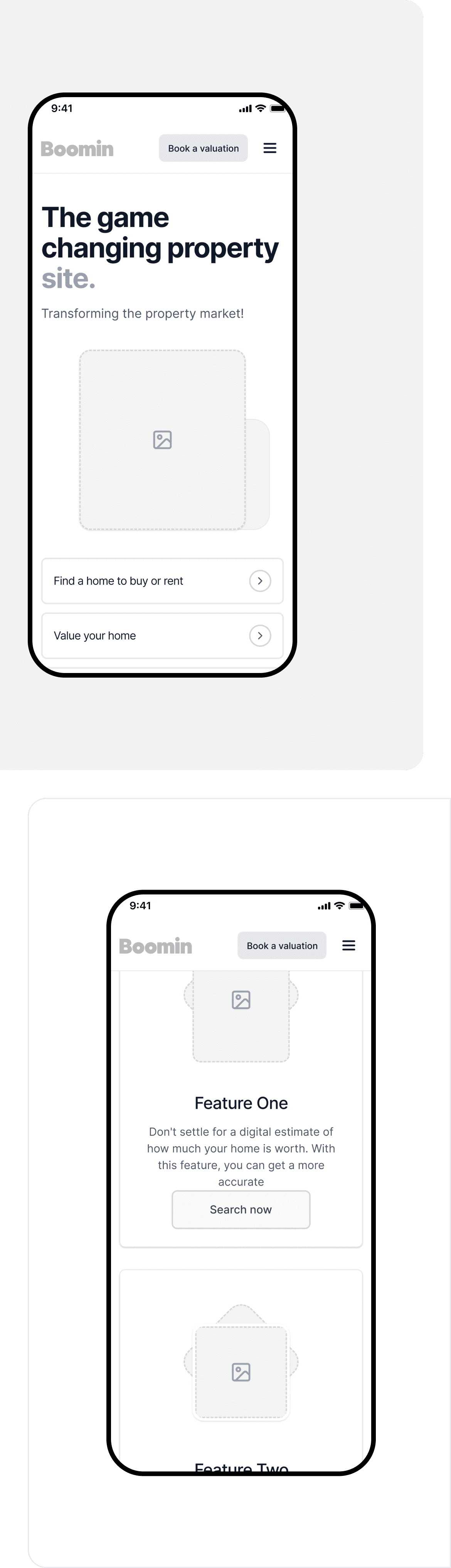
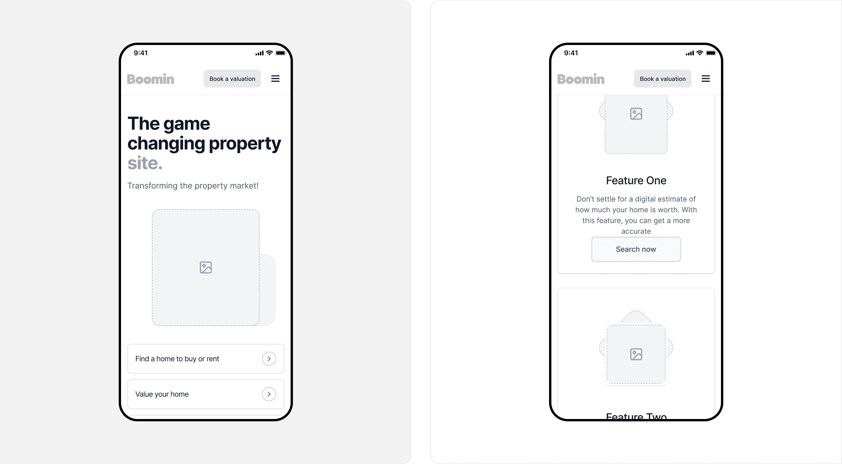
The property listing page balances rich property information with fast scannability. Image-led cards, clear price and location hierarchy, and consistent metadata placement allow users to quickly assess multiple listings without feeling overwhelmed.


MatchMaker
MatchMaker introduces a guided, conversational flow that helps users articulate their preferences and receive more relevant property matches. The interaction model breaks preference capture into small, manageable steps — reducing decision fatigue while maintaining momentum. Clear feedback and progress indicators reinforce a sense of control and personalisation.


SmartVal
SmartVal helps users understand property value with confidence. Valuation is a high-trust, high-consideration moment — the interface prioritises clarity, reassurance, and transparency over dense data. Information is progressively revealed to support decision-making without overwhelming users early in the journey.


The Results
1M
80+
UK estate agents onboarded
SmartVal valuations in 48hrs
Reflection
Boomin shipped to a 1m-user day-one — and still didn't survive the category. That gap between launch traction and durable demand is the lesson I carry forward most: design can win the first scroll, but the product has to earn the second visit. Given more time, I'd have invested earlier in longitudinal behavioural research rather than concept testing, and pushed harder on the personalisation layer that we always knew would do the retention work.