
Home / Work / DPD UK
DPD UK
DPD UK

Project Overview
What this project was, and what I was responsible for.
What this project was, and what I was responsible for.
DPD drivers make around 250 stops a shift, every 3–4 minutes. The existing Saturn 4 platform was built for older scanning hardware — not for BYOD, and not for the reality of delivery work. I led the UX strategy, interaction design, visual system, and cross-platform delivery across iOS and Android.
DPD drivers make around 250 stops a shift, every 3–4 minutes. The existing Saturn 4 platform was built for older scanning hardware — not for BYOD, and not for the reality of delivery work. I led the UX strategy, interaction design, visual system, and cross-platform delivery across iOS and Android.
Role
Senior Product Designer
Responsibilities
UX · UI · Mobile · Design System
Platform
iOS & Android (React Native)
Outcome
Reduced delivery from 3–4 taps to single swipe
Introduction
Saturn is DPD's official mobile application. I joined to redesign the driver experience from the ground up.
Saturn is DPD's official mobile application. I joined to redesign the driver experience from the ground up.
This wasn't a visual refresh. DPD was moving away from dedicated scanning hardware to a BYOD model — drivers using their own phones. That shift exposed how fragile Saturn 4 really was: an interface built for a different device, a different era, and a different kind of driver. The redesign had to work reliably across hundreds of device types, in every condition a delivery driver faces on a real shift.
This wasn't a visual refresh. DPD was moving away from dedicated scanning hardware to a BYOD model — drivers using their own phones. That shift exposed how fragile Saturn 4 really was: an interface built for a different device, a different era, and a different kind of driver. The redesign had to work reliably across hundreds of device types, in every condition a delivery driver faces on a real shift.

The Problem
A legacy system holding drivers back.
A legacy system holding drivers back.
The core issue wasn't aesthetic, it was structural. Every delivery took 3–4 taps and multiple screen transitions before a driver could even start scanning. Multiplied across 250 stops a shift, that friction wasn't a minor annoyance — it was hours lost across a fleet. And with the move to personal devices, the interface had to work on screens it was never designed for, in conditions it was never tested in.
The core issue wasn't aesthetic, it was structural. Every delivery took 3–4 taps and multiple screen transitions before a driver could even start scanning. Multiplied across 250 stops a shift, that friction wasn't a minor annoyance — it was hours lost across a fleet. And with the move to personal devices, the interface had to work on screens it was never designed for, in conditions it was never tested in.


250
Stops per route, every 3–4 minutes. Each one a repeated interaction with the same broken flow.
3–4 Taps
Taps before a driver could scan a single parcel — friction compounded hundreds of times a day.
BYOD
Shift to personal devices exposed an interface built for dedicated hardware, not personal phones.


The Research & Insight
Designing for every driver on the road.
Designing for every driver on the road.
User feedback sessions with active DPD drivers revealed a wider range of digital confidence than expected — from 20-year-old smartphone natives to 55-year-olds who preferred simplicity and predictability. The research pointed to three non-negotiable design constraints that shaped every subsequent decision.
User feedback sessions with active DPD drivers revealed a wider range of digital confidence than expected — from 20-year-old smartphone natives to 55-year-olds who preferred simplicity and predictability. The research pointed to three non-negotiable design constraints that shaped every subsequent decision.
01
One-handed operation
Drivers interact with the app while holding parcels, standing in rain, or walking between van and door. Every tap target, every gesture had to work with a thumb.
02
Low visibility conditions
The interface needed to be readable in direct sunlight, at night, and in low-contrast environments. Colour contrast and text size weren't nice-to-haves — they were functional requirements.
03
Extreme repetition
Every interaction is repeated 250+ times per shift. A single unnecessary tap costs hours across a fleet. The design had to earn every step it asked a driver to take.
The Strategy
From hardware-dependent to human-first.
From hardware-dependent to human-first.
The research reframed the design brief entirely. This wasn't about making Saturn 4 look better — it was about rebuilding the interaction model around real delivery conditions. The strategic shift moved every design decision away from the old hardware assumptions and toward the physical reality of 250 stops a day.
The research reframed the design brief entirely. This wasn't about making Saturn 4 look better — it was about rebuilding the interaction model around real delivery conditions. The strategic shift moved every design decision away from the old hardware assumptions and toward the physical reality of 250 stops a day.
AREA
BEFORE
AFTER
Interaction model
Multi-tap, multi-screen per delivery
Single swipe to begin scanning
Device assumption
Dedicated scanning hardware
BYOD — any personal smartphone
Navigation
Deep hierarchy, multiple transitions
Flat, single-screen delivery context
Failed deliveries
Filtered list, no contextual detail
Distinct workflow with full context
Visual system
Monochrome, no priority signalling
Colour-coded ETA and delivery type
Interaction model
Saturn 4 (Before)
Multi-tap, multi-screen per delivery
Saturn 5 (After)
Single swipe to begin scanning
Device assumption
Saturn 4 (Before)
Desktop-led, mobile adapted
Saturn 5 (After)
BYOD — any personal smartphone
Navigation
Saturn 4 (Before)
Deep hierarchy, multiple transitions
Saturn 5 (After)
Flat, single-screen delivery context
Failed deliveries
Saturn 4 (Before)
Filtered list, no contextual detail
Saturn 5 (After)
Distinct workflow with full context
Visual system
Saturn 4 (Before)
Monochrome, no priority signalling
Saturn 5 (After)
Colour-coded ETA and delivery type
Design Decisions
Three areas. Each with a clear problem, decision, and outcome.
Three areas. Each with a clear problem, decision, and outcome.
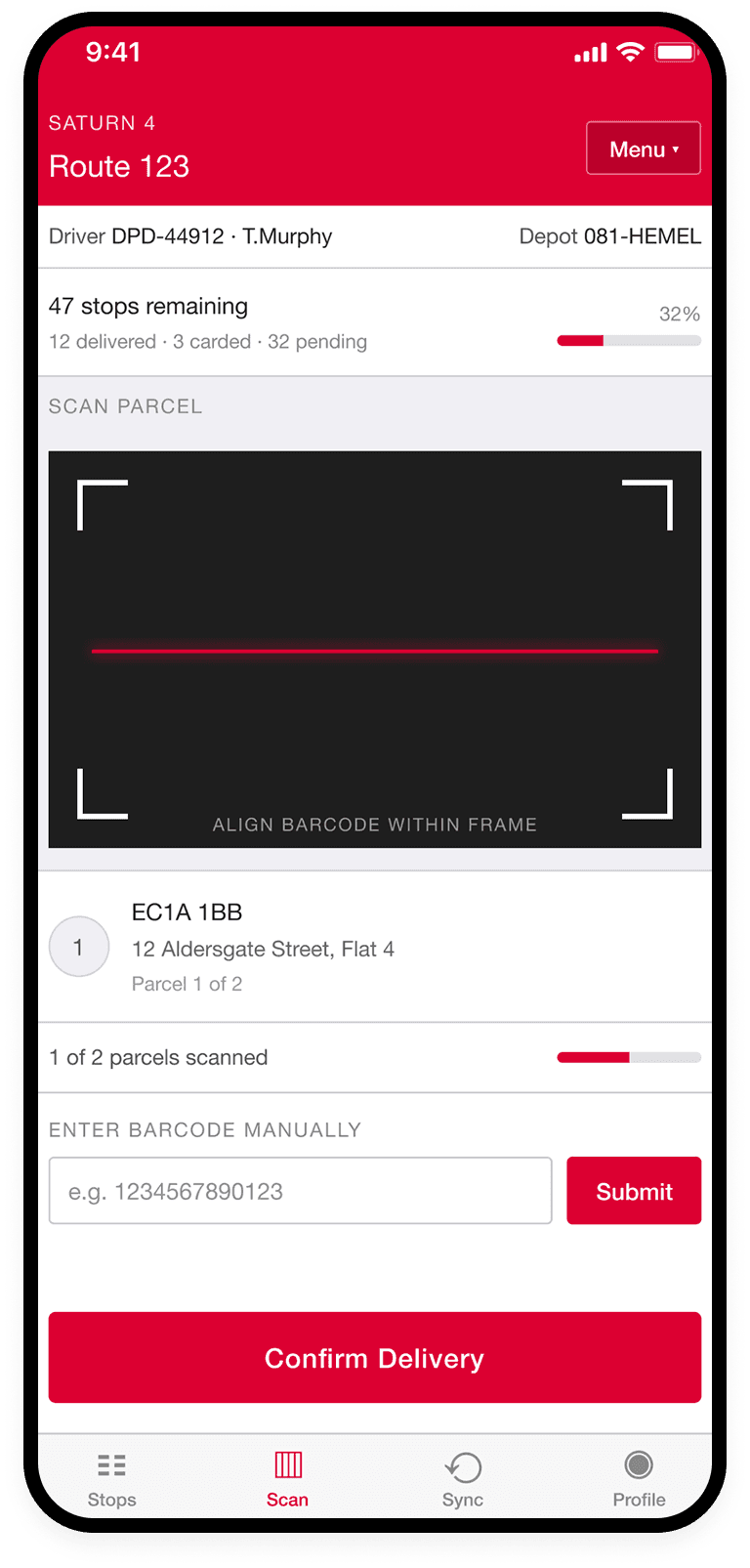
1
Core Delivery Flow
Problem → Decision → Outcome
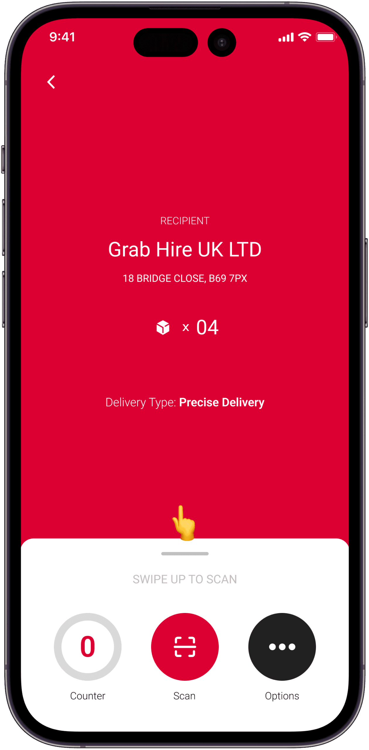
The core flow required 3–4 taps and multiple screen transitions before a driver could begin scanning — compounding across 250 daily stops. Decision: collapse the entire delivery initiation into a single swipe gesture from the main stop list screen, eliminating every intermediate step. Outcome: the most repeated interaction in a driver's day became instantaneous, reducing cognitive load at the highest-frequency touchpoint on the platform.
The core flow required 3–4 taps and multiple screen transitions before a driver could begin scanning — compounding across 250 daily stops. Decision: collapse the entire delivery initiation into a single swipe gesture from the main stop list screen, eliminating every intermediate step. Outcome: the most repeated interaction in a driver's day became instantaneous, reducing cognitive load at the highest-frequency touchpoint on the platform.
Before
After
Before
After
After
2
Stop List & Priority System
Problem → Decision → Outcome
Problem → Decision → Outcome
The original stop list gave drivers no visual priority — every stop looked the same regardless of time pressure or delivery type. Decision: introduce a colour-coded ETA bar system and clear delivery-type labels so the next action is obvious at a glance, without requiring drivers to read every line. Outcome: reduced decision time at the start of each stop, particularly valuable for drivers managing time-sensitive or priority deliveries mid-route.
The original stop list gave drivers no visual priority — every stop looked the same regardless of time pressure or delivery type. Decision: introduce a colour-coded ETA bar system and clear delivery-type labels so the next action is obvious at a glance, without requiring drivers to read every line. Outcome: reduced decision time at the start of each stop, particularly valuable for drivers managing time-sensitive or priority deliveries mid-route.
Before


After
Before


After
Before
After
After
3
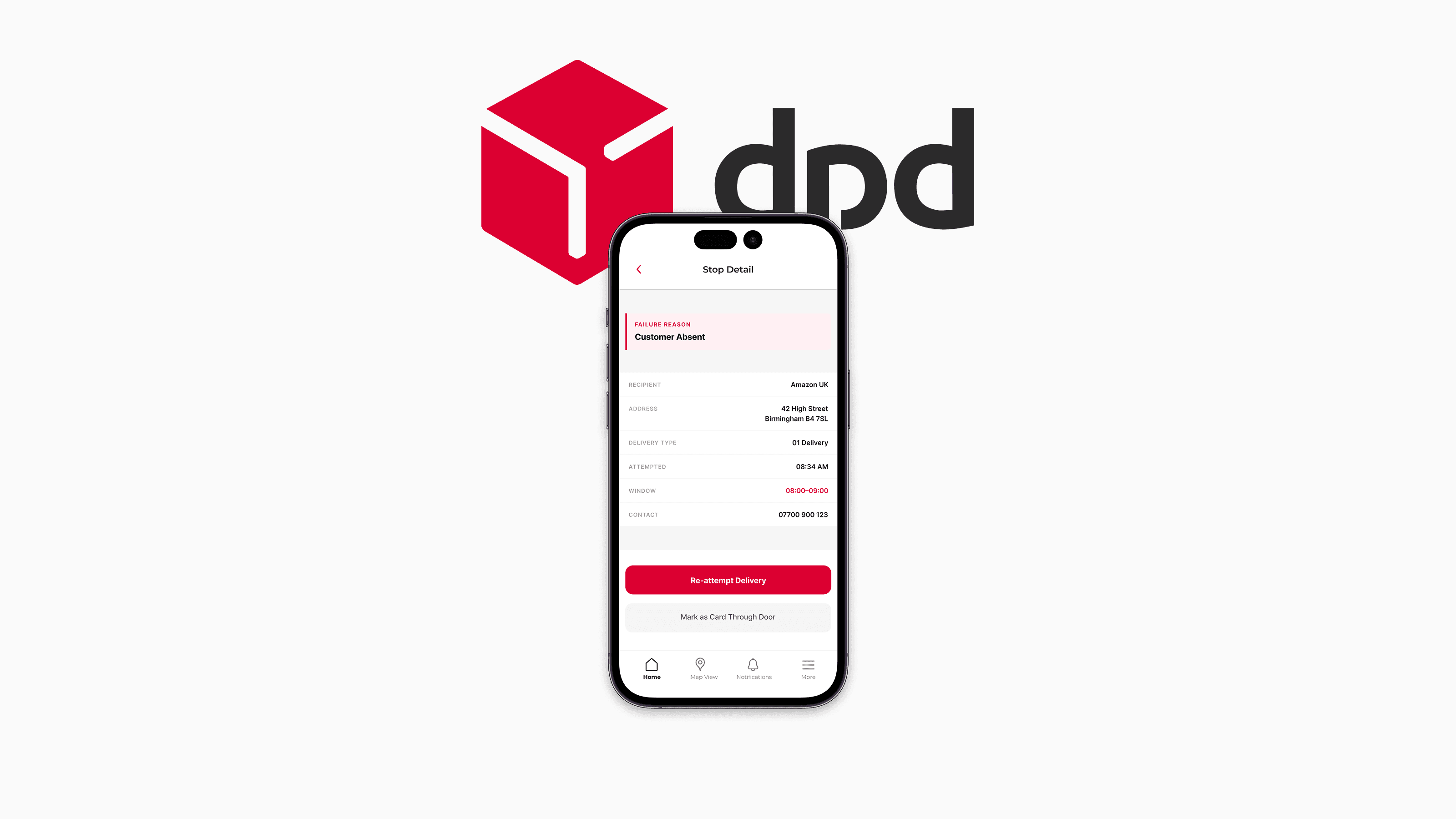
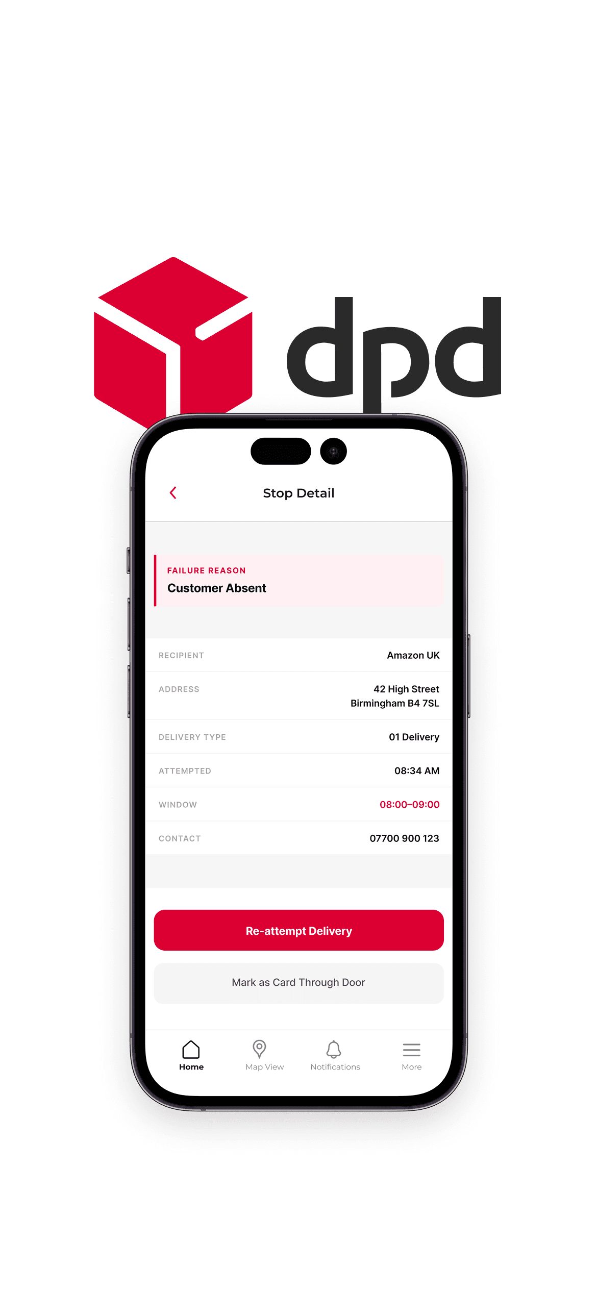
Unsuccessful Stops Workflow
Problem → Decision → Outcome
Failed deliveries were treated as a filtered subset of the main list — giving drivers no additional context about why a delivery failed or what to do next. Decision: treat unsuccessful stops as a completely separate workflow, surfacing failure reason, original delivery window, and re-attempt context in a single dedicated screen. Outcome: reduced driver error on re-attempts and removed a significant source of support calls to DPD depots.
Failed deliveries were treated as a filtered subset of the main list — giving drivers no additional context about why a delivery failed or what to do next. Decision: treat unsuccessful stops as a completely separate workflow, surfacing failure reason, original delivery window, and re-attempt context in a single dedicated screen. Outcome: reduced driver error on re-attempts and removed a significant source of support calls to DPD depots.
Before
After
After
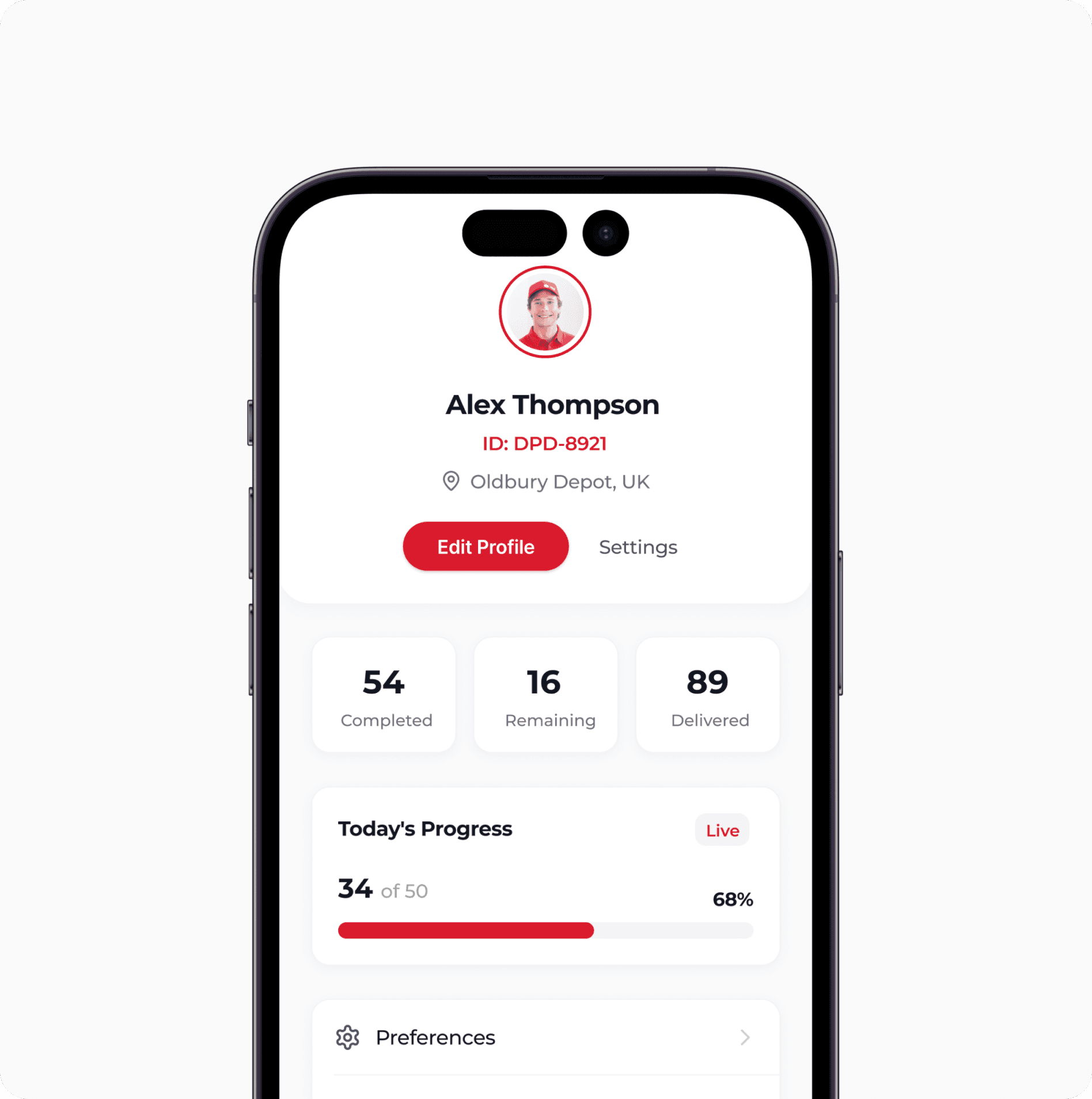
Aa
Roboto
abcdefghijklmnopqrstuvwxyz
0123456789


Alex Thompson
ID: DPD-8921
Oldbury Depot, UK
Button
Button
Button
The Craft
Every screen earns its taps.
Every screen earns its taps.
The visual system was built around the three research constraints — one-handed use, low visibility, extreme repetition. Colour wasn't decorative; it communicated urgency and delivery type. Typography was set larger and heavier than standard mobile conventions. Every tap target was sized for a thumb, not a cursor. The result is an interface that disappears into the workflow rather than demanding attention from it.
The visual system was built around the three research constraints — one-handed use, low visibility, extreme repetition. Colour wasn't decorative; it communicated urgency and delivery type. Typography was set larger and heavier than standard mobile conventions. Every tap target was sized for a thumb, not a cursor. The result is an interface that disappears into the workflow rather than demanding attention from it.
abcdefghijklmnopqrstuvwxyz
Aa
Roboto
0123456789
Button
Button
Button
Oldbury Depot, UK
ID: DPD-8921
Alex Thompson
Design System
Built for React Native, designed for scale.
Built for React Native, designed for scale.
A lightweight mobile design system ensured consistency across every screen and interaction state, while giving the engineering team the patterns they needed to scale features efficiently across iOS and Android. The colour system carried functional meaning — red for DPD brand and urgent actions, navy for chrome, amber and green for delivery status signalling.
A lightweight mobile design system ensured consistency across every screen and interaction state, while giving the engineering team the patterns they needed to scale features efficiently across iOS and Android. The colour system carried functional meaning — red for DPD brand and urgent actions, navy for chrome, amber and green for delivery status signalling.
The Strategy
From hardware-dependent to human-first.
The visual system was built around the three research constraints — one-handed use, low visibility, extreme repetition. Colour wasn't decorative; it communicated urgency and delivery type. Typography was set larger and heavier than standard mobile conventions. Every tap target was sized for a thumb, not a cursor. The result is an interface that disappears into the workflow rather than demanding attention from it.
Design System
Built for React Native, designed for scale.
A lightweight mobile design system ensured consistency across every screen and interaction state, while giving the engineering team the patterns they needed to scale features efficiently across iOS and Android. The colour system carried functional meaning — red for DPD brand and urgent actions, navy for chrome, amber and green for delivery status signalling.
Aa
Roboto
abcdefghijklmnopqrstuvwxyz
0123456789

Alex Thompson
ID: DPD-8921
Oldbury Depot, UK
Button
Button
Button
Cross-platform
Single React Native codebase delivering a consistent experience across iOS and Android.
Real-time
Firebase integration enabling live delivery updates and route changes mid-shift.
BYOD Ready
Tested across a wide range of personal devices, screen sizes, and OS versions.
The Results
A platform 50,000 drivers depend on every day.
A platform 50,000 drivers depend on every day.
Scale lives in the smallest gestures. A single tap removed from a workflow repeated 250 times a day becomes hours returned to a fleet across thousands of drivers. The redesign shipped to all 5,000+ UK depots and became the daily operating platform for DPD's entire driver workforce.
Scale lives in the smallest gestures. A single tap removed from a workflow repeated 250 times a day becomes hours returned to a fleet across thousands of drivers. The redesign shipped to all 5,000+ UK depots and became the daily operating platform for DPD's entire driver workforce.
50K+
Drivers Daily
Active users on the platform across the full UK DPD network every working day
1
Swipe to scan
Reduced from 3–4 taps — the most repeated interaction in a driver's day, simplified to a single gesture
5K+
Depots Supported
Saturn 5 rolled out across the entire UK DPD depot network
Reflection
Designing for repetition changes everything.
Designing for repetition changes everything.
The biggest lesson from Saturn 5 was that scale lives in the smallest gestures — a single tap removed from a workflow repeated 250 times a day becomes hours returned to a fleet. That shift in thinking changed how I approach every interaction design problem since: not "is this usable?" but "what does this cost at scale?"
Given more time, I'd have pushed for longitudinal testing post-launch to quantify those efficiency gains in hard numbers. I'd also have formalised the design system's token structure earlier — the colour and spacing decisions we made informally worked well, but formalising them from the start would have accelerated the feature work that came after.
Due to NDA restrictions, some visual assets and flows have been omitted from this case study. Get in touch for a detailed walkthrough.
Next Project
Boomin
A challenger property portal built from the ground up — defining the UX across search, listing, and discovery for a brand taking on Rightmove and Zoopla.
View Project

Next Project
Boomin
This project reinforced the importance of designing for scale from the start, not just solving the immediate problem, but building foundations the...
View Project
JohnShawCreativeTM
Let’s work together
JohnShawCreativeTM
Let’s work together
JohnShawCreativeTM
Let’s work together