Home / Work / Lounge
Lounge
Lounge

Project Overview
What this project was, and what I was responsible for.
What this project was, and what I was responsible for.
Lounge was at an inflection point — growing beyond its core lingerie audience, expanding into ready-to-wear and accessories, and competing with premium fashion brands for the first time. The commerce platform hadn't kept pace with where the brand was going. As the sole Product Designer, I owned everything from research and strategic framing through to UI delivery and design system work.
Lounge was at an inflection point — growing beyond its core lingerie audience, expanding into ready-to-wear and accessories, and competing with premium fashion brands for the first time. The commerce platform hadn't kept pace with where the brand was going. As the sole Product Designer, I owned everything from research and strategic framing through to UI delivery and design system work.
Role
Sole Product Designer
Responsibilities
Research · Strategy · UX · UI
Platform
Mobile-first web
Outcome
+8% Conversion Uplift

Introduction
As the sole Product Designer at Lounge, I owned the full design process from research and strategic framing through to delivery.
As the sole Product Designer at Lounge, I owned the full design process from research and strategic framing through to delivery.
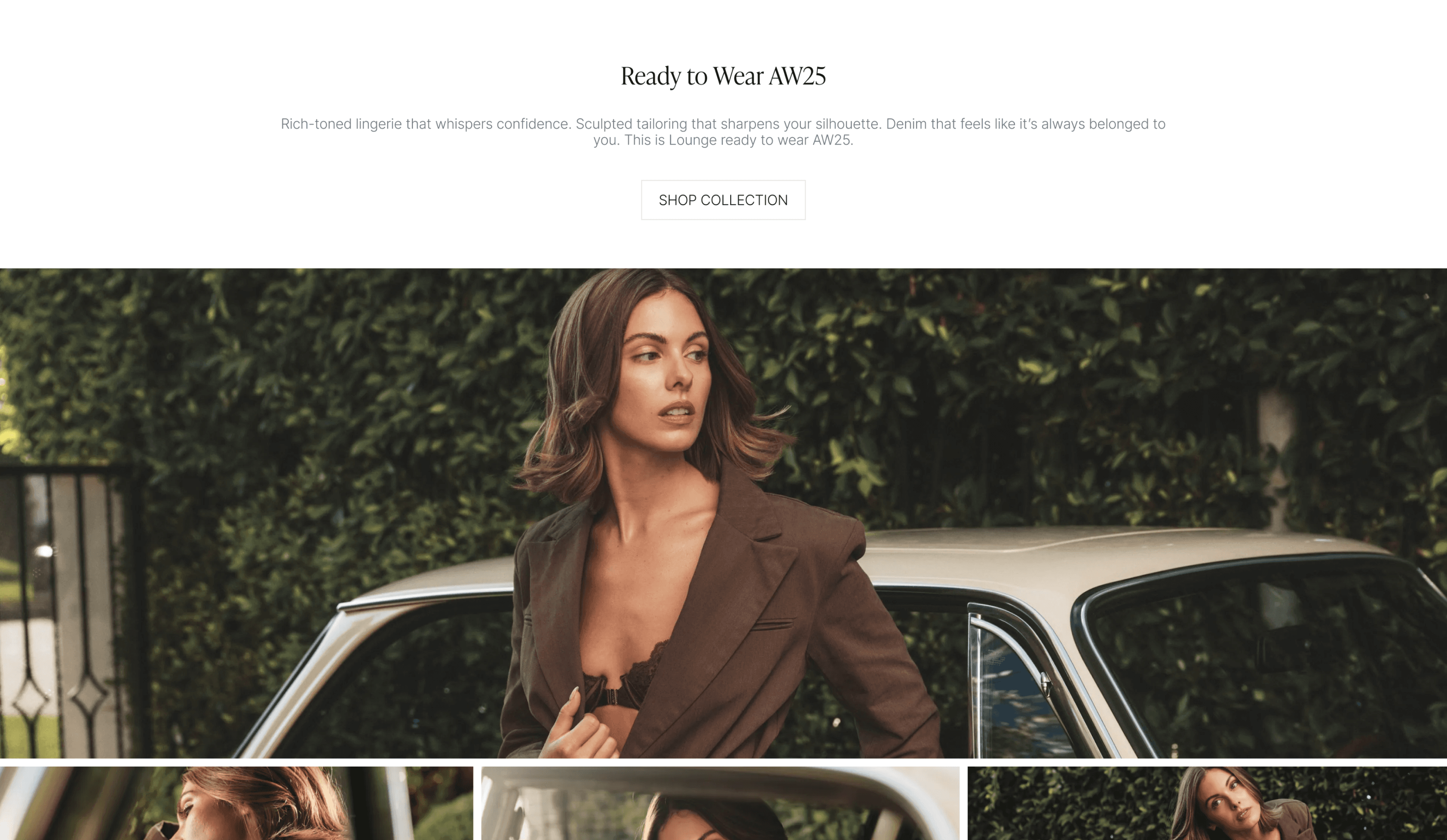
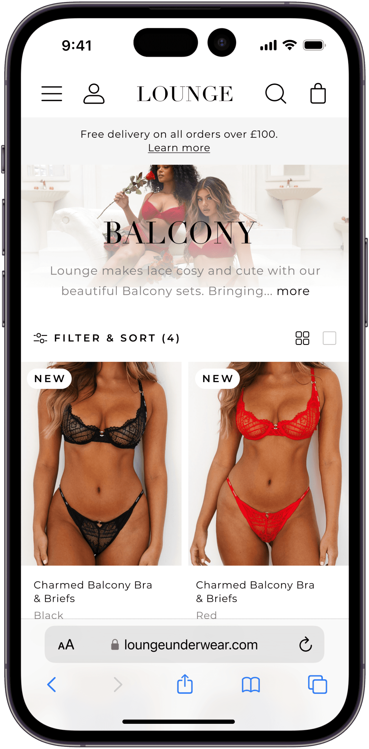
Lounge's visual language and product layouts were built for a narrow range and a different kind of customer. As the brand pivoted upmarket and expanded into ready-to-wear, swimwear, and accessories, the cracks showed fast. The commerce experience needed a ground-up rethink — not just a visual refresh, but the product catching up with the brand strategy.
Lounge's visual language and product layouts were built for a narrow range and a different kind of customer. As the brand pivoted upmarket and expanded into ready-to-wear, swimwear, and accessories, the cracks showed fast. The commerce experience needed a ground-up rethink — not just a visual refresh, but the product catching up with the brand strategy.

The Problem
A platform built for lingerie, asked to sell a lifestyle.
A platform built for lingerie, asked to sell a lifestyle.
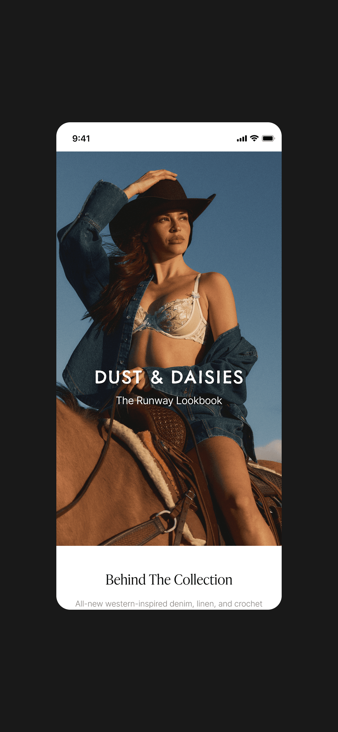
Drop-off rates were high during browse — not at checkout. The platform couldn't hold the brand it was becoming. What was needed was a ground-up rethink of editorial-first layouts, flexible collection architecture, and a visual system capable of holding a campaign like Dust & Daisies with the same confidence as a product grid.
Drop-off rates were high during browse — not at checkout. The platform couldn't hold the brand it was becoming. What was needed was a ground-up rethink of editorial-first layouts, flexible collection architecture, and a visual system capable of holding a campaign like Dust & Daisies with the same confidence as a product grid.


The Research & Insight
What the data showed.
What the data showed.
I collaborated with the analytics team to map behavioural patterns across session recordings and funnel data. The findings pointed clearly at browse — not checkout — as the point of failure, and specifically around the higher-priced new categories that needed more considered decision-making.
I collaborated with the analytics team to map behavioural patterns across session recordings and funnel data. The findings pointed clearly at browse — not checkout — as the point of failure, and specifically around the higher-priced new categories that needed more considered decision-making.


97%
of all Lounge traffic came from mobile — the redesign had to be mobile-native, not mobile-adapted.
↓ Browse
Drop-offs occurred during browsing, not at checkout — users weren't converting on higher-priced new categories.
Nav
Session recordings identified navigation as a primary friction point for new category discovery.
Mental model
Before
Checkout-optimised
After
Discovery-first
Platform approach
Before
Desktop-led, mobile adapted
After
Mobile-native from the start
Category experience
Before
Category as list
After
Category as editorial
Navigation
Before
Dropdown-heavy, text dense
After
Visual cards, reduced cognitive load
Product grid
Before
Fixed single layout
After
Flexible density system (3 modes)

Before

After
Mental model
Before
Checkout-optimised
After
Discovery-first
Platform approach
Before
Desktop-led, mobile adapted
After
Mobile-native from the start
Category experience
Before
Category as list
After
Category as editorial
Navigation
Before
Dropdown-heavy, text dense
After
Visual cards, reduced cognitive load
Product grid
Before
Fixed single layout
After
Flexible density system (3 modes)
The Strategy
From transaction-led to discovery-led.
From transaction-led to discovery-led.
The insight reframed the brief. This wasn't a visual refresh — it was a structural shift in how the platform treated its customers. From optimising for purchase to enabling exploration. The three-column table below captures the core strategic shift across every area of the redesign.
The insight reframed the brief. This wasn't a visual refresh — it was a structural shift in how the platform treated its customers. From optimising for purchase to enabling exploration. The three-column table below captures the core strategic shift across every area of the redesign.
AREA
BEFORE
AFTER
Mental model
Checkout-optimised
Discovery-first
Platform approach
Desktop-led, mobile adapted
Mobile-native from the start
Category experience
Category as list
Category as editorial
Navigation
Dropdown-heavy, text dense
Visual cards, reduced cognitive load
Product grid
Fixed single layout
Flexible density system (3 modes)
Design Decisions
Three areas. Each with a clear problem, decision, and outcome.
Three areas. Each with a clear problem, decision, and outcome.
1
Global Navigation
Problem → Decision → Outcome
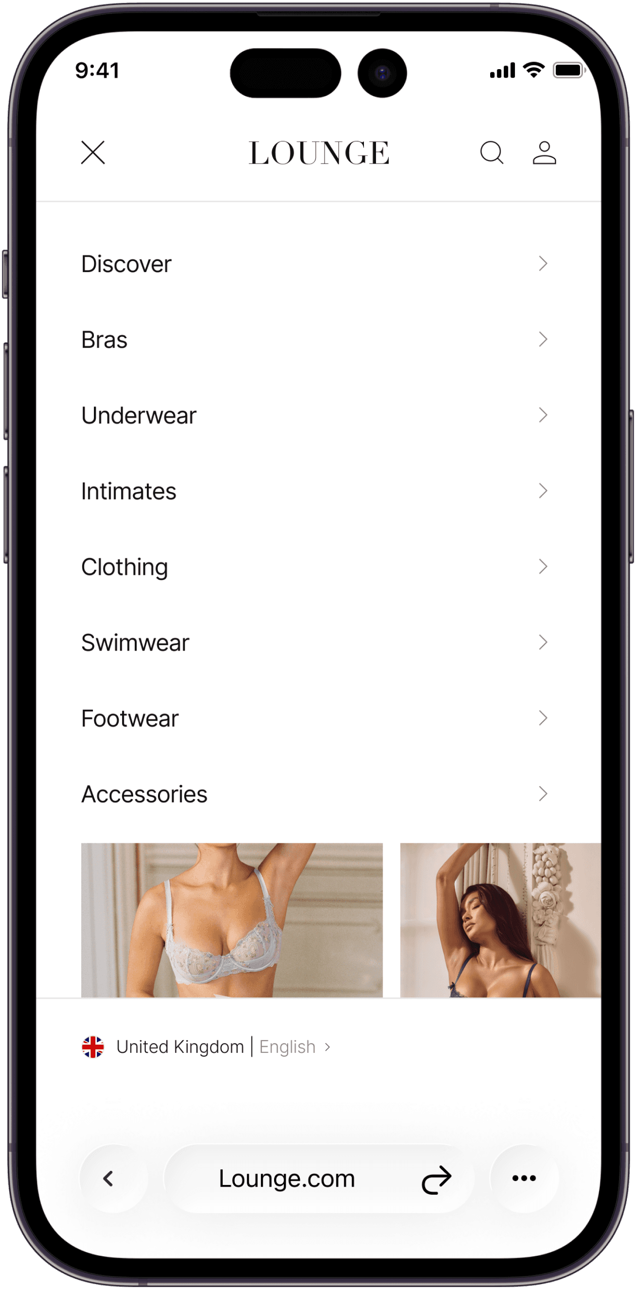
The existing navigation was dropdown-heavy and text-dense, creating friction for users discovering new categories. Decision: replace with a single-level visual card system — one decision per screen, with imagery to support browse behaviour. Outcome: measurably reduced navigation drop-off and cleaner path to product.
The existing navigation was dropdown-heavy and text-dense, creating friction for users discovering new categories. Decision: replace with a single-level visual card system — one decision per screen, with imagery to support browse behaviour. Outcome: measurably reduced navigation drop-off and cleaner path to product.
Before
After
After
Before


After
2
Product List Page (PLP)
Problem → Decision → Outcome
Problem → Decision → Outcome
The old collection page read like a checkout queue — text-led, dense, indistinguishable from any other underwear site. Decision: introduce a visual filter system and flexible grid density (Low / Balanced / High) that lets customers see product differences at a glance. Editorial layout, cleaner typographic hierarchy, and breathing room around imagery. Outcome: the page now reads as a brand experience, not a product catalogue.
The old collection page read like a checkout queue — text-led, dense, indistinguishable from any other underwear site. Decision: introduce a visual filter system and flexible grid density (Low / Balanced / High) that lets customers see product differences at a glance. Editorial layout, cleaner typographic hierarchy, and breathing room around imagery. Outcome: the page now reads as a brand experience, not a product catalogue.
Before
After
Before

After
3
Mobile-First Approach
Problem → Decision → Outcome
With 97% of traffic on mobile, the redesign couldn't be a responsive afterthought. Decision: design mobile-first across the full journey — browse, product, bag — tuning content hierarchy, tap targets, and navigation for one-handed use. Desktop followed the mobile system, not the other way round. Outcome: a cohesive experience built around the device the majority of Lounge customers actually use.
With 97% of traffic on mobile, the redesign couldn't be a responsive afterthought. Decision: design mobile-first across the full journey — browse, product, bag — tuning content hierarchy, tap targets, and navigation for one-handed use. Desktop followed the mobile system, not the other way round. Outcome: a cohesive experience built around the device the majority of Lounge customers actually use.
Before
After


Knitted Shorts
£40.00
ADD TO BAG
You may also like
Recently viewed

New In
Blossom Maxi Dress with Bodysuit
£100.00

New In
Blossom Maxi Dress with Bodysuit
£100.00
New In
Structured Knitted Jacket
£70.00

New In
Knitted Mini Skirt
£100.00
9:41
Knitted Shorts
£40.00
ADD TO BAG
You may also like
Recently viewed
New In
Blossom Maxi Dress with Bodysuit
£100.00
New In
Blossom Maxi Dress with Bodysuit
£100.00
New In
Structured Knitted Jacket
£70.00
New In
Knitted Mini Skirt
£100.00
9:41
The Craft
A visual language for browsing, not just buying.
A visual language for browsing, not just buying.
The system wasn't rebuilt from scratch — core tokens and components were refined to support a more premium expression while maintaining functional consistency. The outcome reduced duplication across the component library and gave the engineering team clearer patterns to build against.
The system wasn't rebuilt from scratch — core tokens and components were refined to support a more premium expression while maintaining functional consistency. The outcome reduced duplication across the component library and gave the engineering team clearer patterns to build against.

Knitted Shorts
£40.00
ADD TO BAG
You may also like
Recently viewed
New In
Blossom Maxi Dress with Bodysuit
£100.00

New In
Blossom Maxi Dress with Bodysuit
£100.00
9:41
Design System
A leaner, more consistent system.
A leaner, more consistent system.
Rebuilding the system wasn't just a design exercise — it gave engineering a single source of truth and reduced component duplication by 15%. Three principles guided every decision throughout.
Rebuilding the system wasn't just a design exercise — it gave engineering a single source of truth and reduced component duplication by 15%. Three principles guided every decision throughout.

Low Density
Balanced
High Density
Single product focus for considered purchases. Maximises image real estate and product detail visibility on mobile.
Components
Product Cards
Navigation
Cart UI
PDP Grid
Refined
Spacing, rhythm, and corner treatments standardised across all touch points
Unified
Global components consistent across navigation, PLP, PDP, and cart
Scalable
Patterns designed for reuse as new categories and markets launch
An interactive look at the Lounge design system
Product Cards
Navigation
Cart UI
PDP Grid
Low Density Grid
Balanced Grid
High Density Grid
Single product focus for considered purchases. Maximises image real estate and product detail visibility on mobile.
The Results
Measurable impact across the journey.
Measurable impact across the journey.
For a brand at Lounge's revenue scale, an 8% conversion uplift represents significant incremental GMV — not a rounding error. The system improvements had downstream effects on engineering velocity too.
For a brand at Lounge's revenue scale, an 8% conversion uplift represents significant incremental GMV — not a rounding error. The system improvements had downstream effects on engineering velocity too.
+8%
Spacing, rhythm, and corner treatments standardised across all touch points
15%
Global components consistent across navigation, PLP, PDP, and cart
Improved engagement across the full journey
Improved engagement across the full journey
Behavioural metrics time on PLP, scroll depth, add-to-bag rate all moved in the right direction following the redesign. The discovery-first model reduced bounce during browse and supported the brand's push into higher-consideration purchase categories.
Behavioural metrics time on PLP, scroll depth, add-to-bag rate all moved in the right direction following the redesign. The discovery-first model reduced bounce during browse and supported the brand's push into higher-consideration purchase categories.
Reflection
The hardest part wasn't the design — it was the balance.
The hardest part wasn't the design — it was the balance.
Conversion performance and brand elevation pull in opposite directions, and every decision on this project lived in that tension. The redesign held both because the system was built to flex, not just to ship.
Looking back, I'd invest earlier in longitudinal testing to validate decisions over time rather than relying on short-window metrics. I'd also explore personalisation within the discovery flows — the architecture we built is capable of it, and it's the natural next step for a brand trying to serve multiple customer profiles from a single platform.
Next Project
DPD UK
Saturn is DPD's official mobile application, built to support parcel collections and deliveries across the UK. I joined the team to redesign the driver experience from the ground up, simplifying…
View Project

Next Project
DPD UK
Saturn is DPD's official mobile application, built to support parcel collections and deliveries across the UK. I joined the team to redesign the driver experience from the ground up, simplifying…
View Project
Next Project
DPD UK
Saturn is DPD's official mobile application, built to support parcel collections and deliveries across the UK. I joined the team to redesign the driver experience from the ground up, simplifying…
View Project
JohnShawCreativeTM
Let’s work together
JohnShawCreativeTM
Let’s work together
JohnShawCreativeTM
Let’s work together
